Monday, January 28, 2013

Scandinavian Art

One of the things I love about Pinterest is discovering new artists (new to me, that is). I came across an extremely unique calder-esque carved wood & bone necklace and had to find out more about the artist. It was by Swedish jewelry designer Torun Bülow-Hübe circa 1950. While researching Torun, I found many other fantastic Scandinavian artists. This painting in particular by Danish artist Henning Gjedde struck me. The colors: a stunning combination of coral, pinks, black & white. The shapes: abstract, geometric, simple forms. The composition: collage-like bold but light-weight elements in a purposeful simplified chaos.

re-pin this: Henning Gjedde, 1958


re-pin this: Torun Bülow-Hübe, Sweden. Early 1950's

Sunday, December 9, 2012

The Graphic Impulse

I came across the online portfolio of art director & graphic designer Brigitta Bungard today. She is part of the design team at The Museum of Modern Art in New York. One piece in her portfolio that really stood out was the title wall for a German Expressionism exhibit that she created along with her MOMA teammates Julia Hoffmann (creative direction), Jesse Reed (design), Paulette Giguere (production artist). They won several awards for the design including Communication Arts: Design Annual 52, 2012; Type Directors Club: Typography Annual 33, 2012; Global SEGD Design Awards: Merit 2012; and Print Magazine Regional Design Awards, 2012.


About the exhibition via segd.com:

German Expressionism: The Graphic Impulse was an exhibition of more than 250 prints, drawings, paintings, sculptures, illustrated books, and periodicals drawn from MoMA’s collection of 3,000 pieces from this period. The vast amount of work inspired the idea of transforming the galleries into a time capsule of sorts—prompting visitors to feel as if they were walking into a cumulative presentation of this unique movement of art’s many works.
The title wall was clearly legible as visitors exited the elevators to enter the 6th floor Special Exhibition Gallery, but as they approached the entrance, they discovered the shift between the walls, which cut the title in two. This cut, emphasized by the red wall color, also symbolized World War I, a pivotal point for the German Expressionist movement and artists. Inside the exhibition, visitors could see this motif repeated in the layout and color of the gallery walls. The in-house design team used letters from an old wood type alphabet, which at huge scale emphasized the imperfection of prints, yet still felt bold and contemporary. A closer look revealed how the black letters were painted with the texture of an enlarged woodcut, alluding to the texture of many of the prints in the exhibition.

The challenge of utilizing a large gallery space for the title of an exhibition is choosing the appropriate proportion and scale, and the team was able to capitalize on the exhibition’s long title to create an atmosphere that might not have been possible under other circumstances.

View the rest of Brigitta's portfolio here: http://www.brigittabungard.com/


source: brigittabungard.com
photo credit: Martin Seck

Weaved Inspiration


WOVEN WALL PANELS  by JUSTINE ASHBEE

source: patternity.co.uk

Monday, October 1, 2012

Packaging Ideas

The holidays are right around the corner. I know, I can't believe it either. I just found this really great blog with a great compilation of unique packaging ideas that I thought I would share. Think outside the box this holiday season and get creative with your wrapping. It doesn't have to be time consuming or expensive. Check out these great ideas below and for more ideas visit: www.ohhellofriendblog.com


sources and diy instructions: sunday suppers, parcel post, whipper berry, decor8, project wedding

Thursday, August 16, 2012

Many Facets

I love this jacquard loom woven afghan by graphic artist turned functional object designer Matt W. Moore. His new company CORE DECO makes coasters, shelving, and jacquard afghans all adorned with his signature graphic patterns. The video is a little much with the sexy music but it does help you see how soft and comfy the 100% cotton geometric patterned throw is. Needless to say, I want one!!!

The "Crystal" afghan features a faceted triangulation array


source: mocoloco.com

Tuesday, August 14, 2012

Elementary

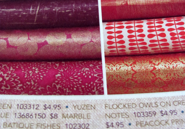
When the Paper Source catalog arrived in the mail yesterday, I was as giddy as a 3rd grader. While browsing through the colorful & whimsical pages of things that I don't NEED, I had a flashback of elementary school and HAVING to have these crazy pens and pencils in my desktop pencil box and how exciting it was when I would get to go to the mall and buy a new one. You remember the ones I am talking about right? I'm sure I had a pencil printed with pastries and sweets and a slice 'o cake eraser on top. Well, when I saw the file folders with the vintage typewriter illustration on front in the Paper Source catalog, for a split second I thought to myself - "that is so cute, I have to have that." But then reason kicked in (something you don't have as a kid) and I realized that I am a 33 year old woman and I DON'T need them, nor do I really WANT them. But much like the actual store, the Paper Source catalog is just so much fun to look at and really inspires creativity and if something brings you back to your inner child, that can only be a good thing.


I love these striped paper straws - $6.95 for a box of 144


Gorgeous Giftwrap

Sunday, August 12, 2012

This is really cool. When Portuguese beer maker Sagres released a chocolate flavored beer, they decided to celebrate by making their website entirely out of chocolate. What? I was confused at first too. I figured that their website was simply illustrated to look like it was chocolate. Nope. Master chocolatier, Victor Nunes, known for his chocolate sculptures, actually created each component of the interface design - buttons, boxes, text, backgrounds, logo - out of real chocolate, photographed each of the parts and pieces and then their web design firm created a flash website with a stop motion-esque look and feel. Check it out for yourself here (fyi you must be 18+ to view the site since it is for a beer and it is in portuguese, so click the button on the left that says "sim" which means "yes" - you are over 18).

Check out the video of the whole process below:


source: odditycentral.com